
How to Make Your Edifice Site Mobile-Friendly
Tips for Every User


More than half of all web traffic today comes from mobile devices.That means if your site isn’t easy to use on a phone, you could be losing customers before they even read your first sentence.
The good news? Every Edifice site is automatically mobile-responsive, so your layout adjusts to fit any screen. Still, there are a few things you can do to make sure your site looks and works perfectly on smaller devices.
1. Preview Your Site in Mobile View
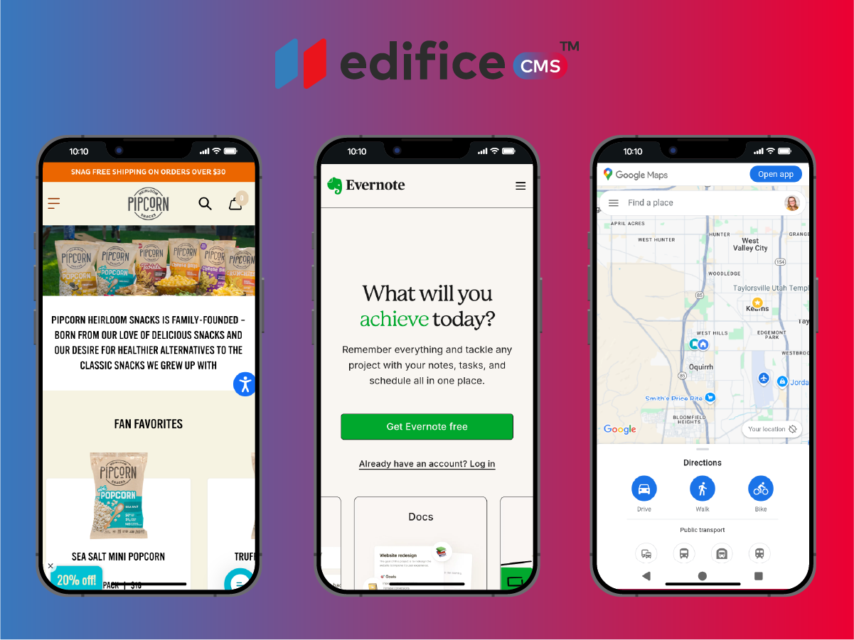
Edifice gives you a built-in mobile preview mode so you can instantly see how your site will look on different screen sizes.
Click the mobile icon in your dashboard to switch views and scroll through your pages as if you were a visitor.
When you do this, look for:
- Text that looks too small or too large
- Images that don’t fit the screen nicely
- Sections that feel “squished” together
Fix these issues before publishing so you know your site will look clean and easy to read.
2. Keep Your Headlines Short
A headline that looks great on a desktop might wrap awkwardly or take up half the screen on a phone. Mobile users skim fast, so you want your headlines to be short, direct, and easy to read at a glance.
Tips:
- Keep them under 8–10 words when possible
- Avoid long compound sentences
- Put the most important keywords first
For example: Instead of: “Discover the Amazing Variety of Organic, Locally-Sourced Produce Available at Our Farmer’s Market”
Try: “Fresh, Local, Organic Produce”
3. Avoid Overloading Your Pages
On mobile, less is more.
A huge block of text or 10 stacked images might feel fine on a desktop but can overwhelm a phone user.
Break your content into short paragraphs and clear sections.
Use bullet points for quick facts, and avoid cramming too many large images in one spot. Think of your mobile site like a conversation — give the most important details first, then let people dig deeper if they want.
4. Use Large, Clickable Buttons
Ever tried clicking a tiny link on your phone and ended up opening the wrong page?
It’s frustrating, and your visitors will leave if it happens too often.
With Edifice, you can easily make buttons big enough to tap with a thumb. Place them in obvious spots — ideally after your main message or in the middle of important sections.
Pro tip:
- Use contrasting colors so buttons stand out
- Avoid stacking too many buttons close together
- Keep the text on buttons short: “Shop Now,” “Book Today,” “Contact Us”
5. Optimize Your Images
Big, uncompressed images can slow your site down, especially on mobile data.
Edifice automatically optimizes images for you, but you can help by starting with files that aren’t unnecessarily large.
For most uses:
- Keep file sizes under 500 KB when possible
- Use JPG for photos and PNG for logos or graphics
- Avoid uploading images directly from your phone without resizing if they’re huge
Remember: fast-loading images = happy visitors.
6. Check Your Navigation Menu
On mobile, your navigation collapses into a small “hamburger” menu in the corner. That means you only have a few chances to get people where they want to go.
Make sure:
- Your most important pages are at the top of the menu
- Labels are clear and simple (“About Us” vs. “Our Story of Growth and Success Since 1984”)
- You don’t overload the menu with too many options
Simple menus make for happy mobile users.
7. Test on a Real Phone
Mobile preview mode is great, but nothing beats testing on your actual phone.
Click every button, scroll through every section, and check how fast it loads.
You may spot small issues, like:
- A button that’s slightly too low on the page
- An image that looks fuzzy
- A section that feels too long before you get to the main point
If possible, test on both Apple and Android devices — they can display things a little differently.
Final Note: Don’t Forget to Publish
Your edits won’t show up live until you hit Publish. A red bell next to your page name means it’s still unpublished. Once you’ve tested your site and made sure it works beautifully on mobile, publish it so your visitors get the best experience no matter what device they’re using.

Edifice CMS is the digital chisel in your hands, scripting your website dreams into reality with its intuitive interface , stunning templates, and powerful tools, allowing you to build an online masterpiece without the need for coding expertise.

© 2025 Edifice CMS, All rights reserved.